
1st part - REBRAND
This project focuses on the complete redesign of the visual identity for Nicolaides Optician, aiming to modernize the brand while respecting its long-standing heritage since 1926. Through research and conceptual exploration, the identity was built around values such as trust, quality, accessibility, and innovation.
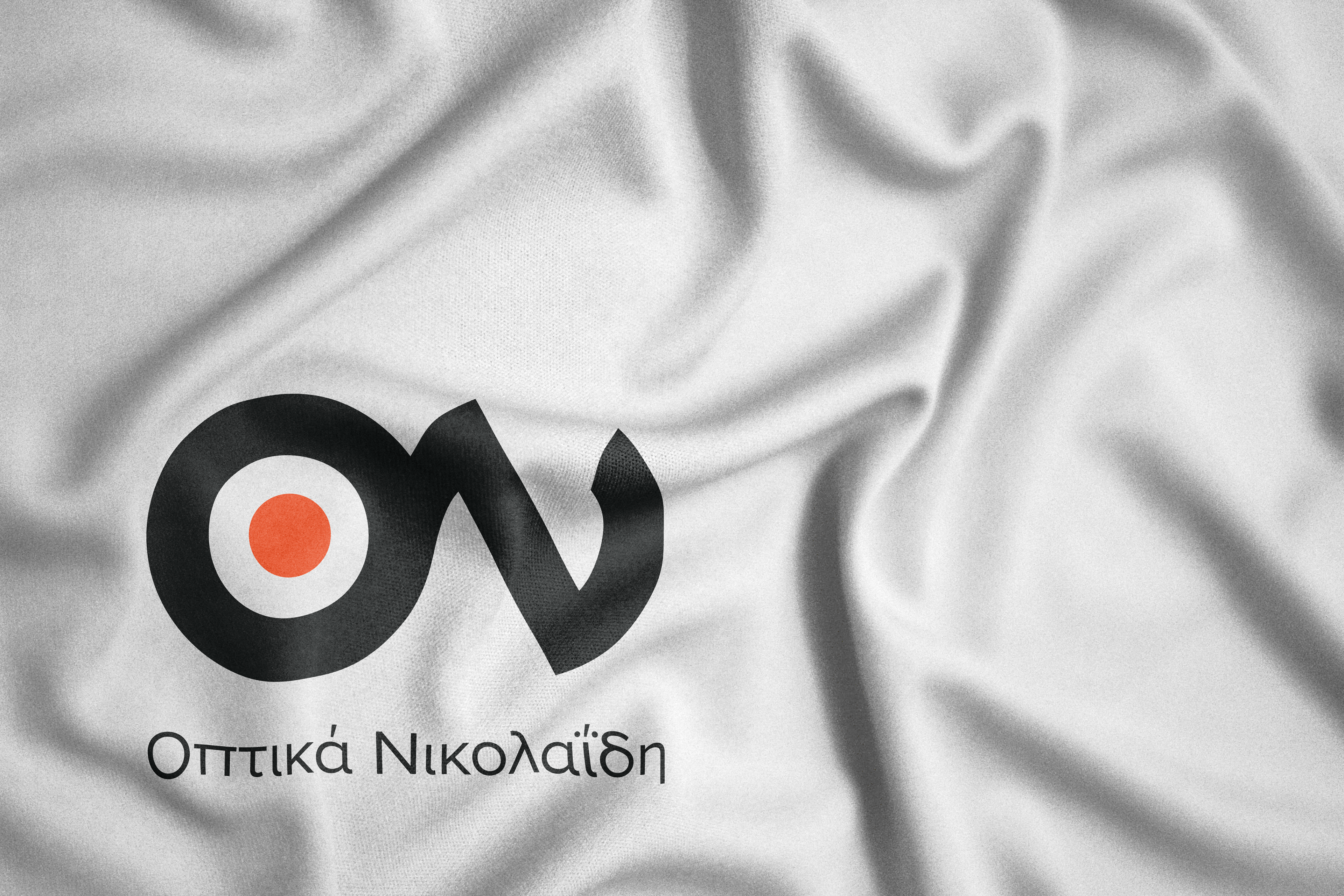
The logo combines symbolic elements of vision, glasses, the eye, and the frame, integrated with the brand’s initials to create a minimalist yet meaningful mark, while the typography and color palette reinforce a balance between professionalism and approachability.
A vibrant orange was selected to convey optimism, energy, and clarity, supported by a contemporary typographic system and flexible visual applications across print and digital media. The final outcome is a cohesive, modern, and recognizable brand identity that communicates expertise, warmth, and reliability in the field of optical care.
logotype
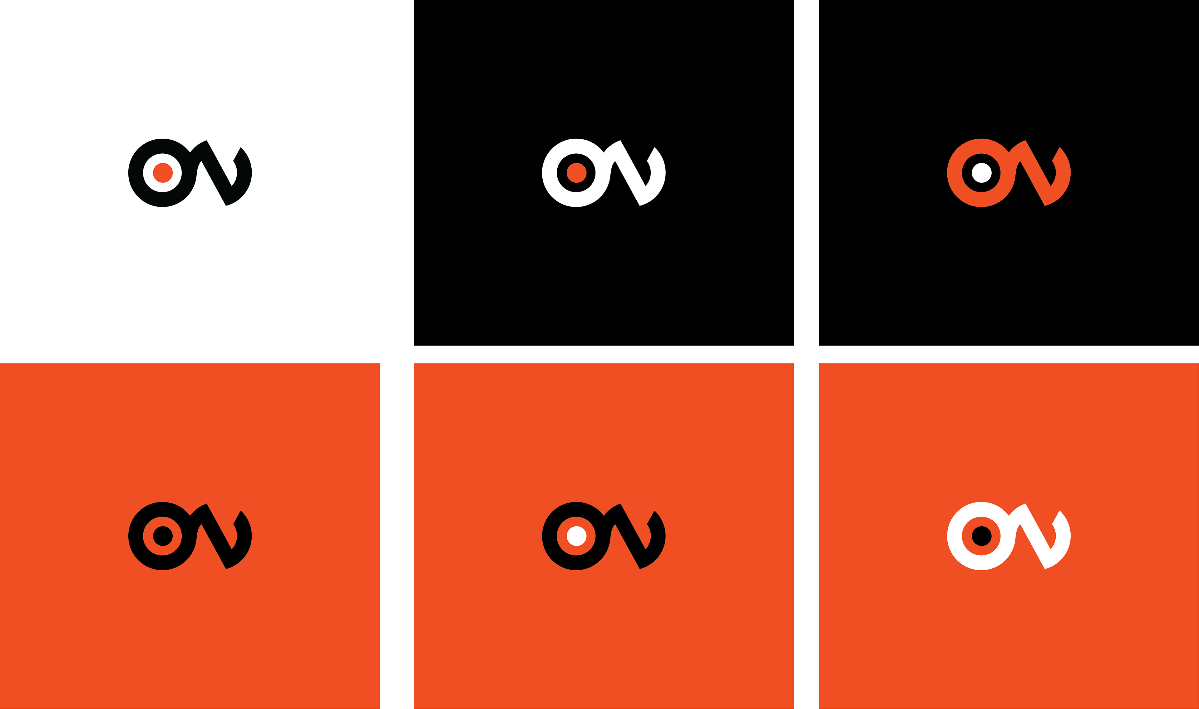
logo colour palette variations
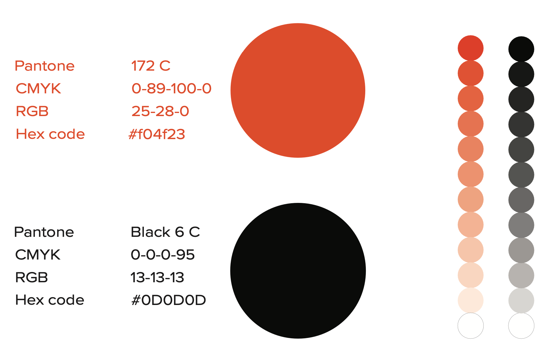
Colour Palette
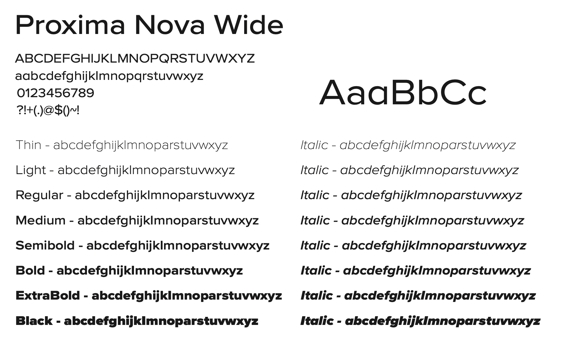
Typography system
Logotype
environmental branding
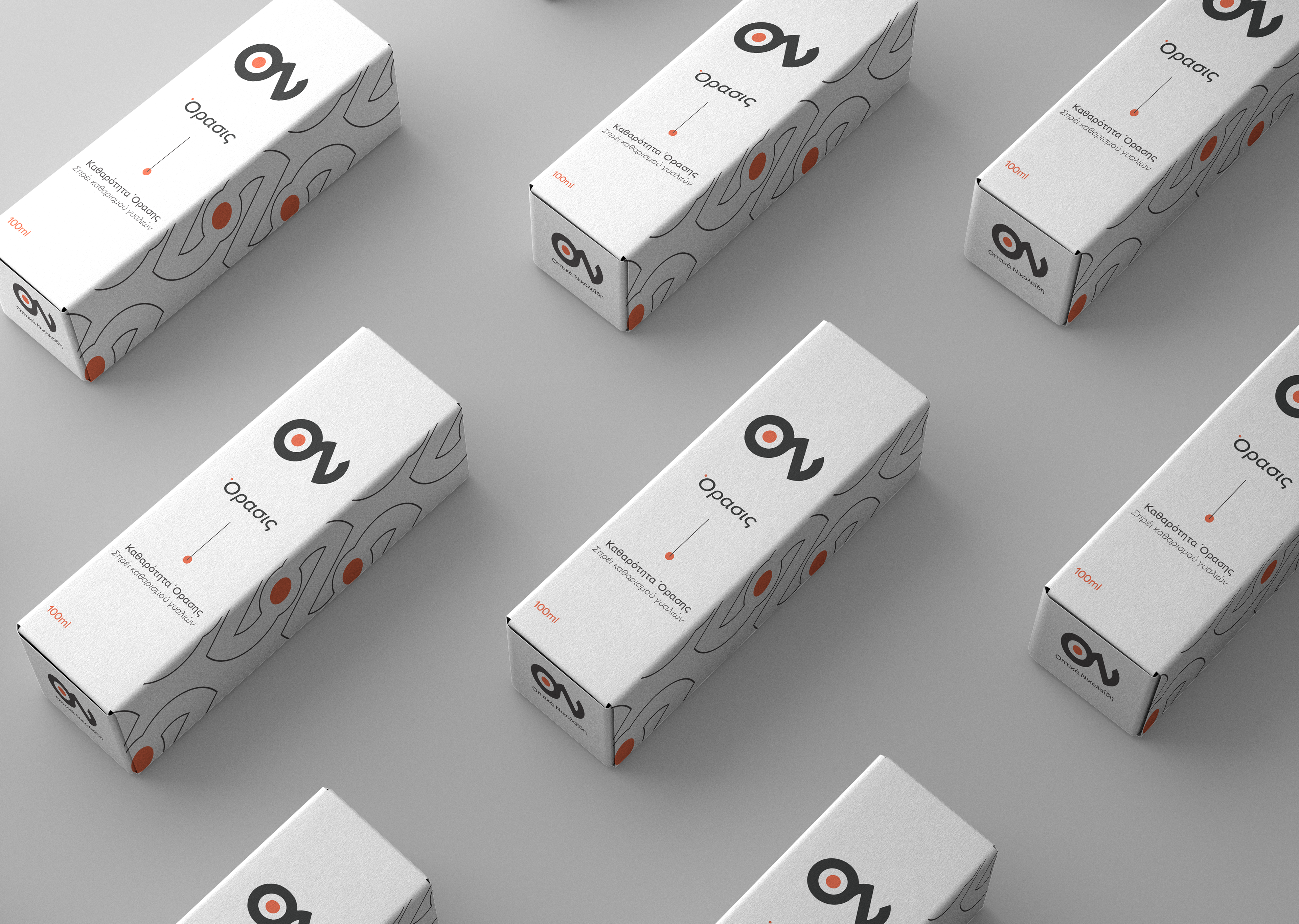
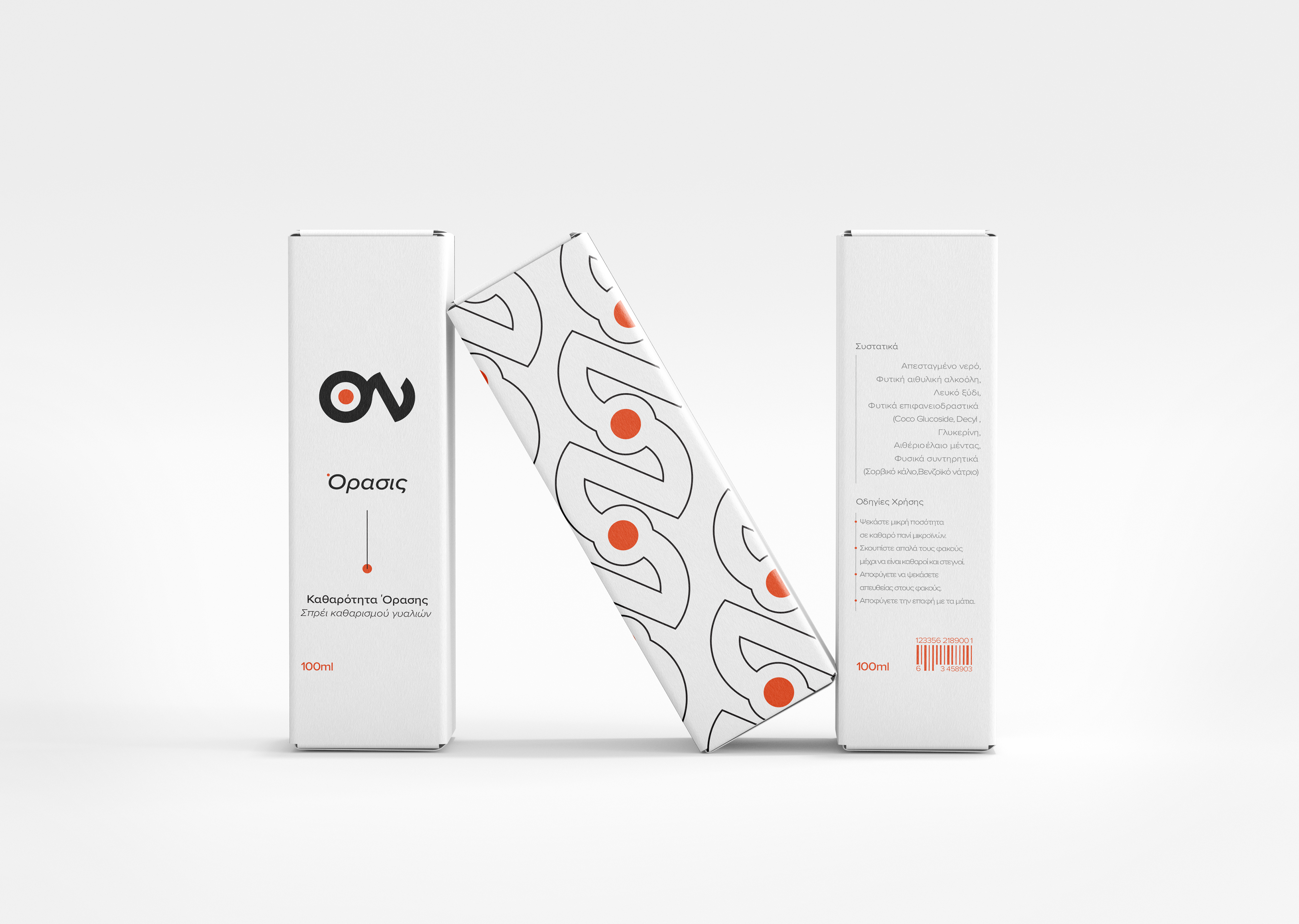
lens spray
lens spray box sides
branded glasses cloth
case
tags
branded accessory
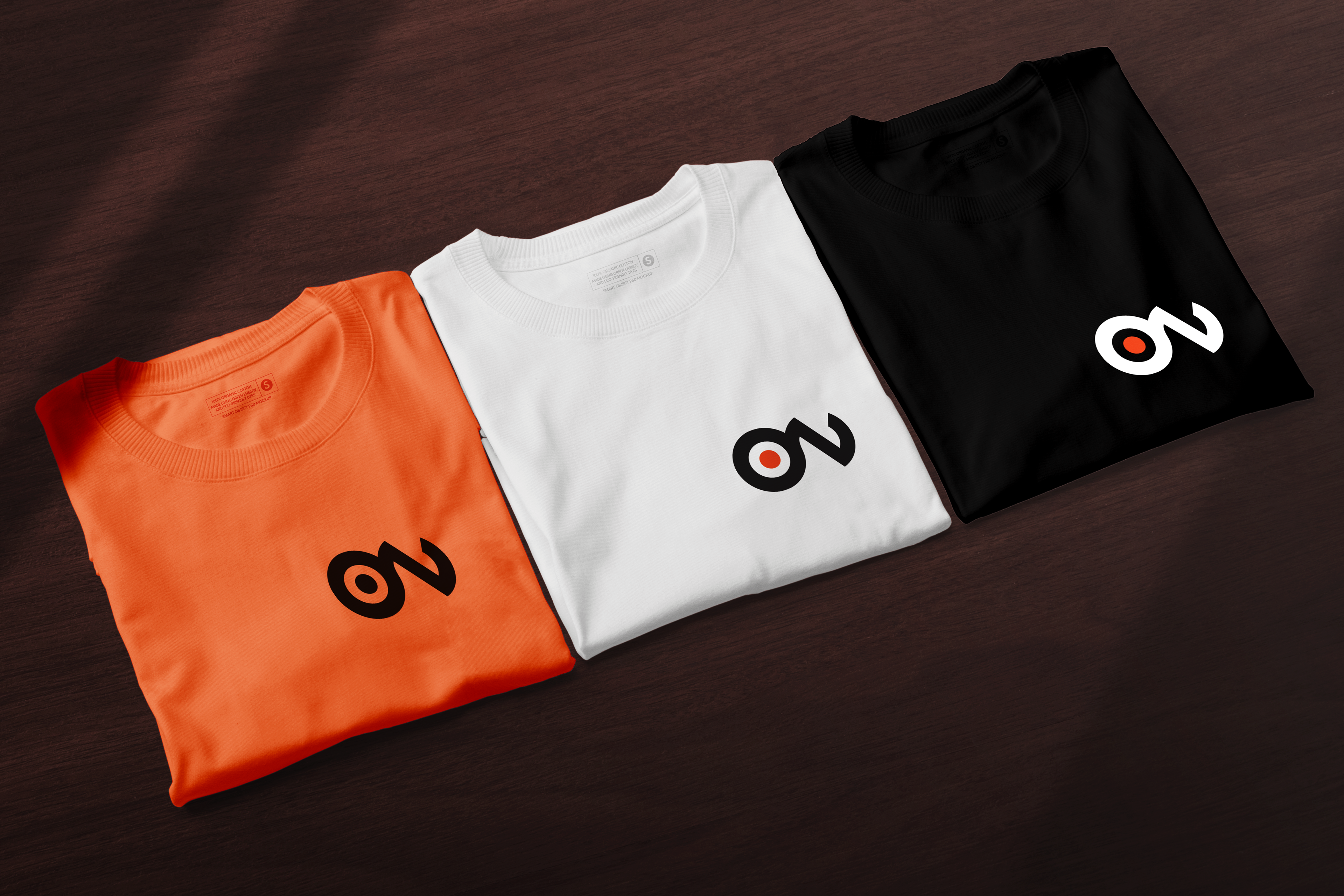
employees branded shirts
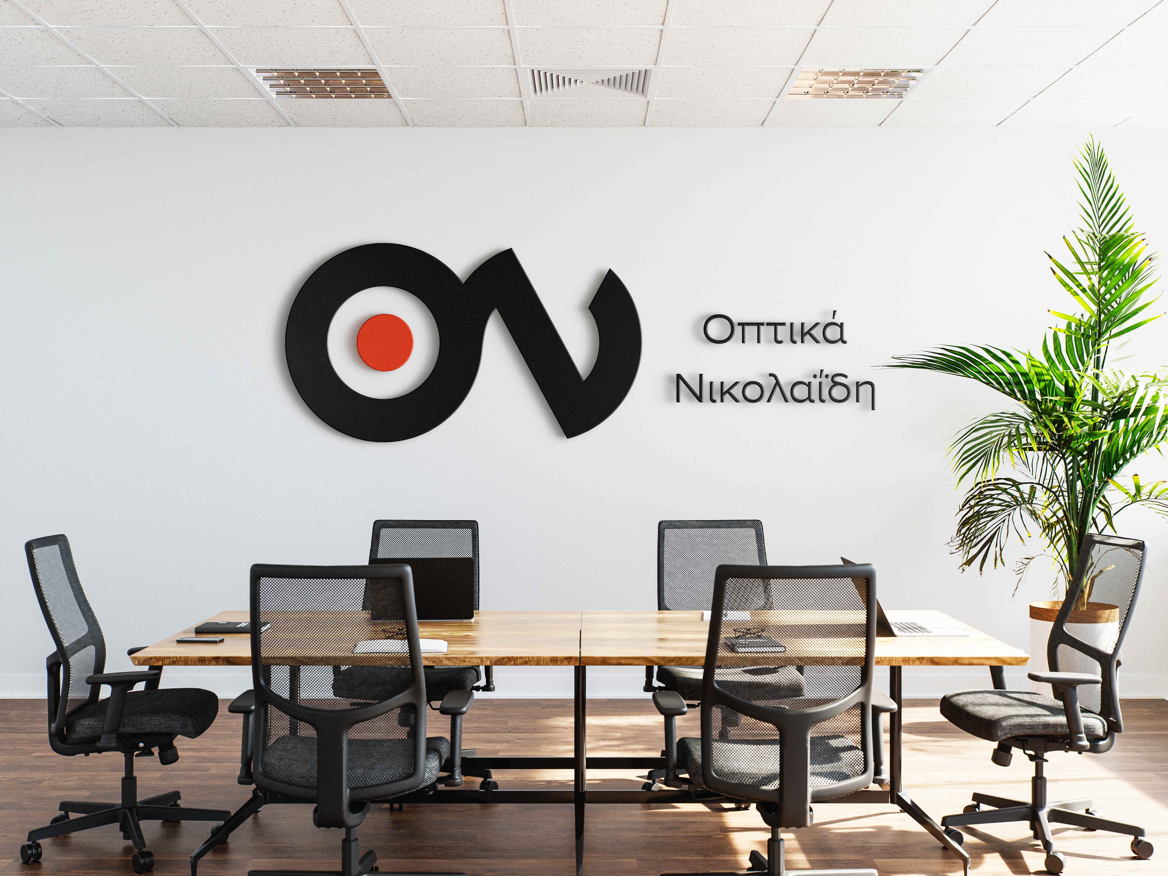
environmental design
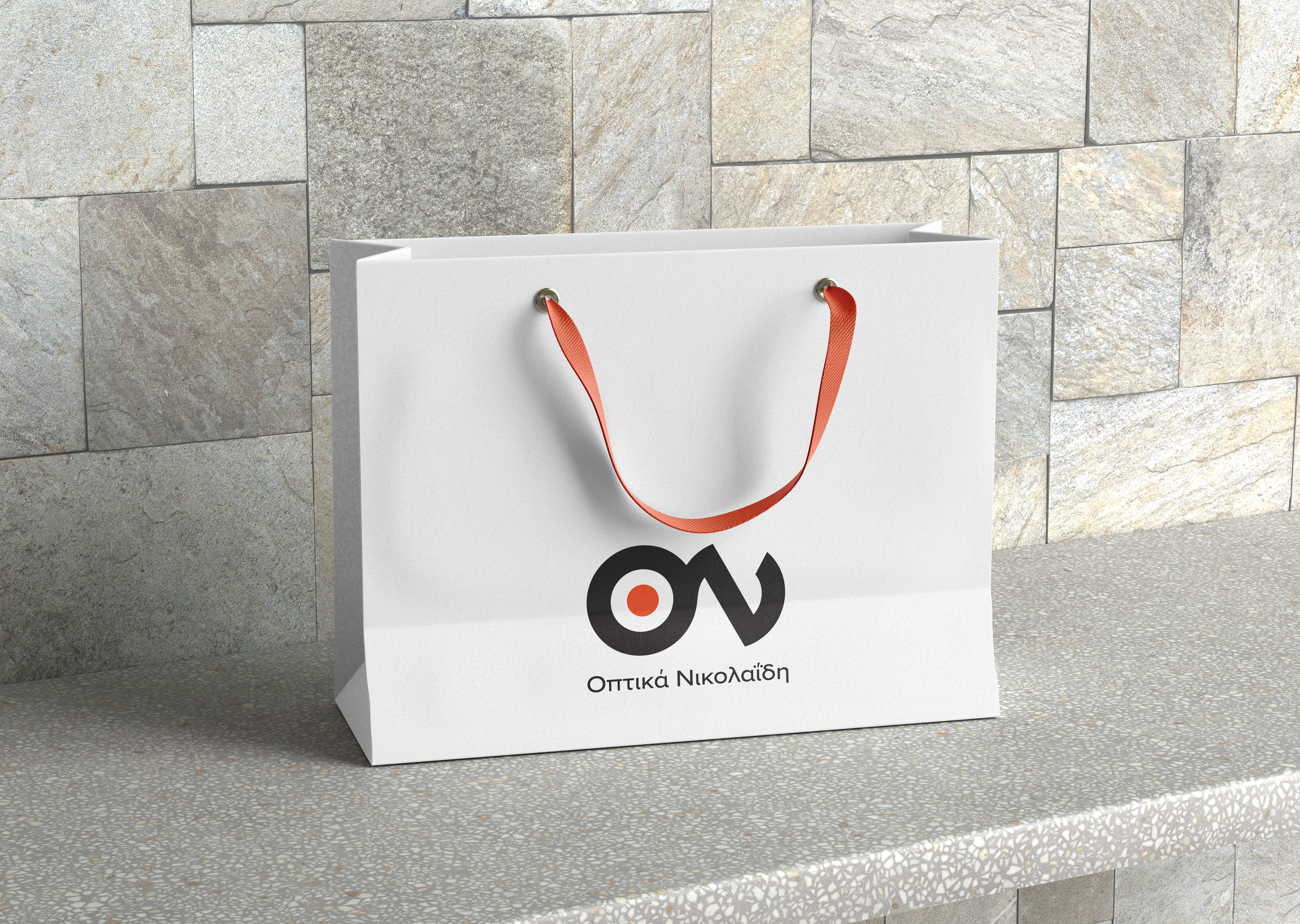
shopping bag
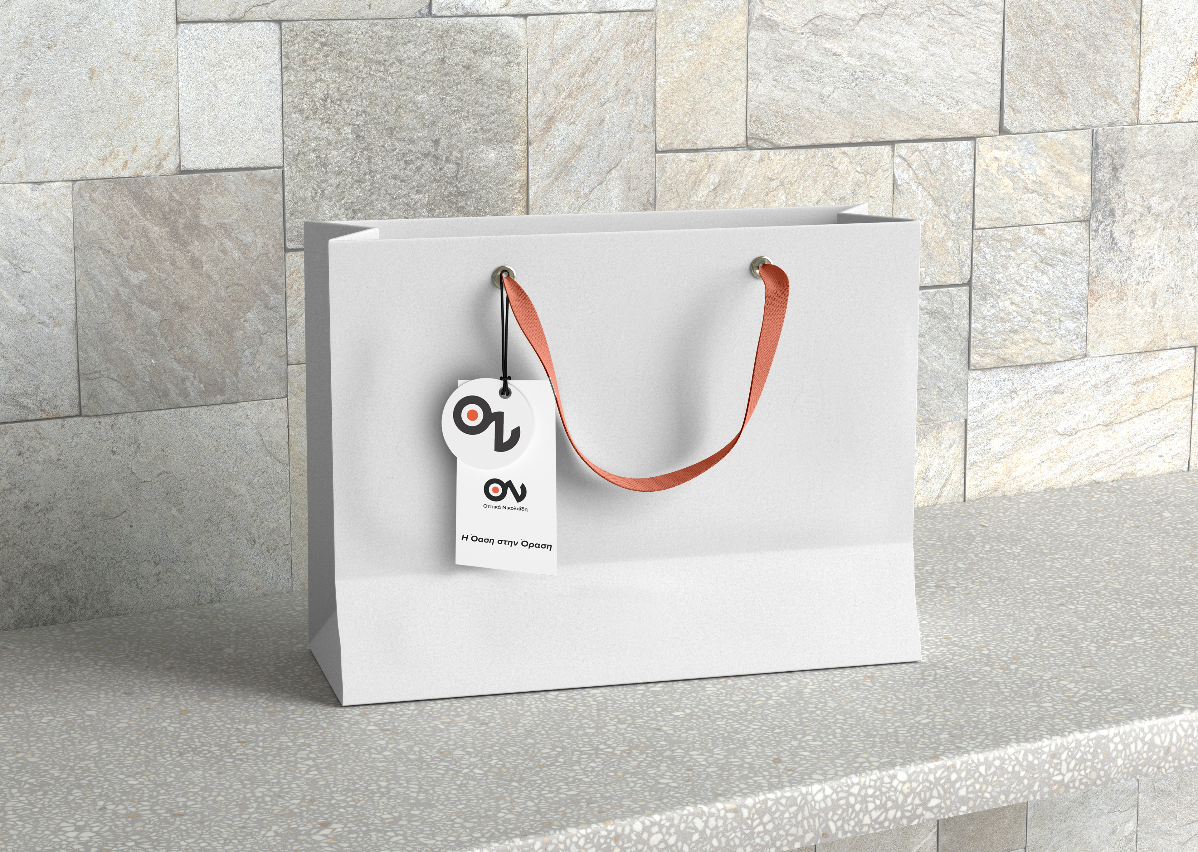
shopping bag other side

Thankyou Cards
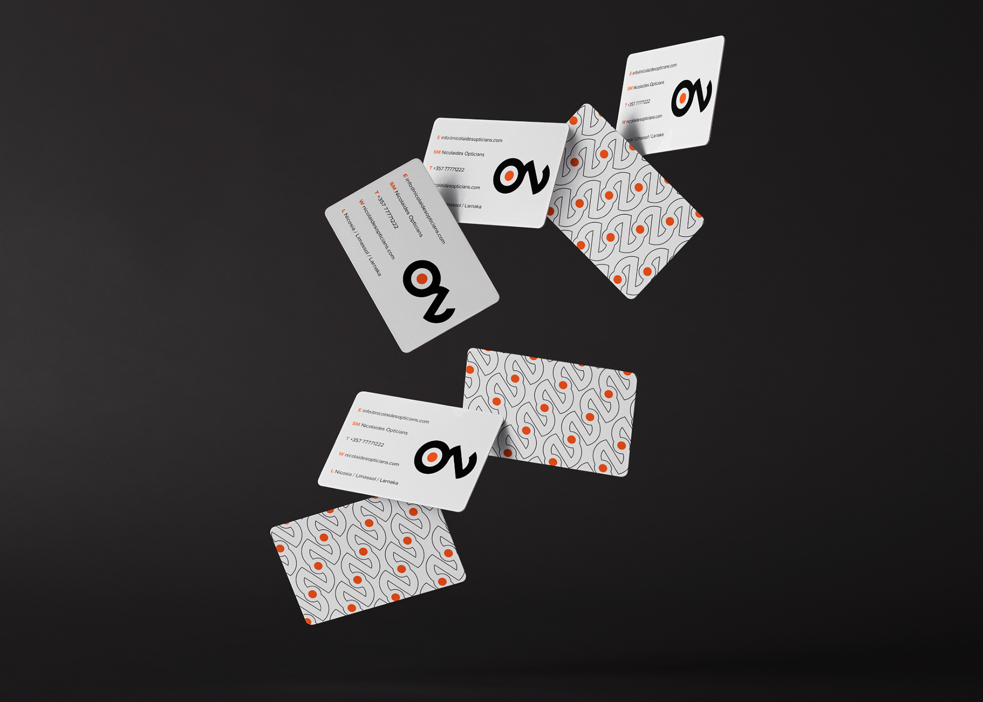
business card
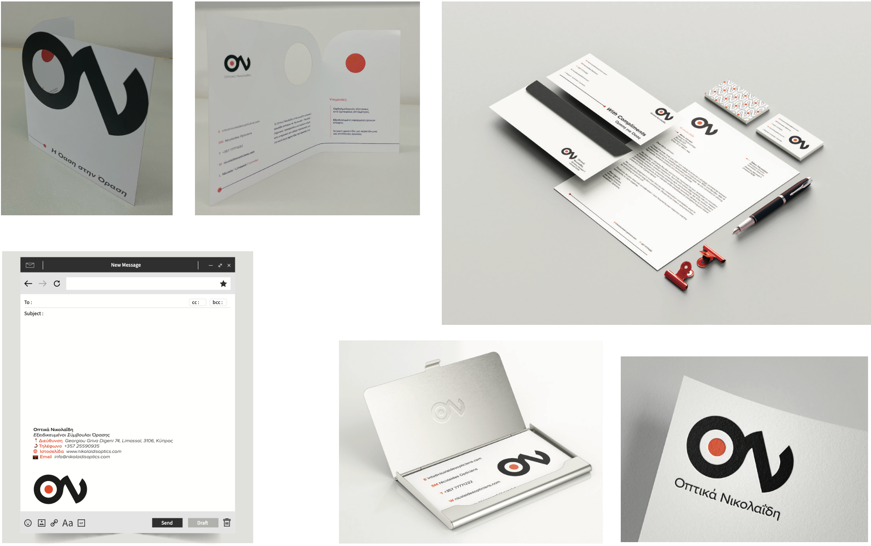
Stationary
2nd part - Advertising Design Campaign
1st scale - Poster design
The advertising campaign for Nicolaides Optician was designed to communicate the brand’s expertise and human-centered approach to vision care through a clear, conceptual idea. This part of the project includes two posters for interior spaces and one outdoor poster, adapted for public visibility.
Having the slogan: «Βλέπουμε τις διαφορές – Δημιουργούμε τη λύση» (we see the diferences, we create the solution),
The campaign translates different eye conditions into minimal, symbolic visuals inspired by optical measurement tools, creating an immediate connection to precision and care.
A consistent visual system using the brand’s color palette ensures strong recognition across print and outdoor applications, while maintaining clarity and impact. The campaign emphasizes personalized solutions rather than problems, positioning the brand as a trusted vision specialist.
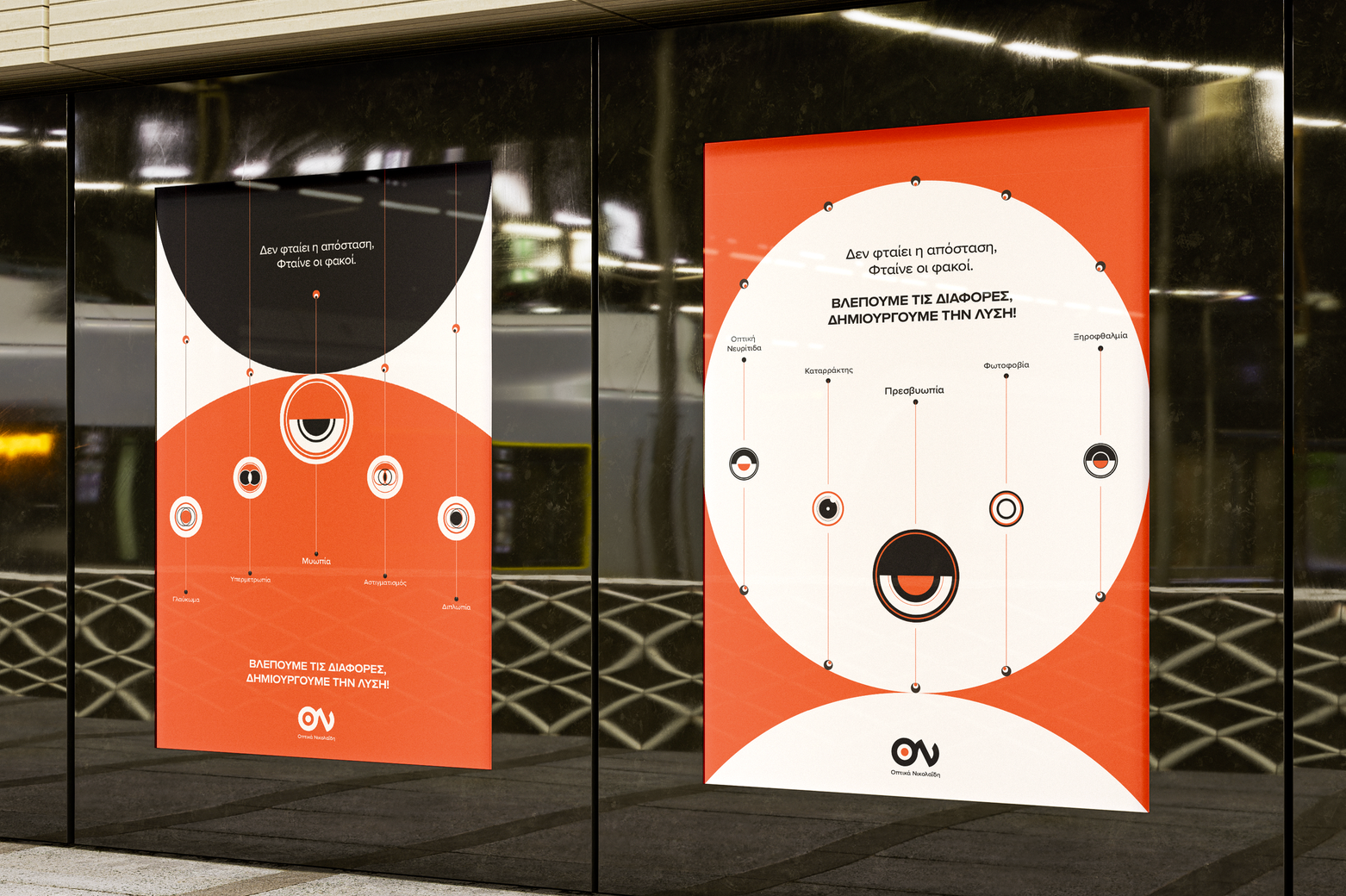
Indoor posters
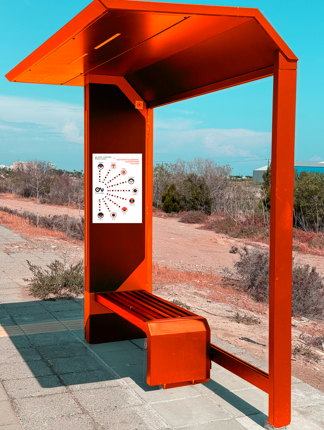
outdoor-bus station
2nd scale - Motion design
The motion videos bring the campaign visuals to life by animating the symbolic forms of each vision condition in a clear and engaging way. Through a minimal and precise animation process, the static poster elements were translated into motion while maintaining consistency in color, typography, and overall brand identity.
Adverstising Video
Vertical Motion Video for social media
The project was developed in collaboration
with Despoina Sorokkou.